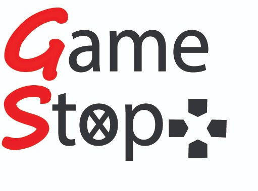
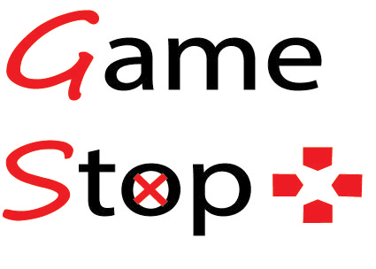
Game Stop - New logo !!
- iarocciempire
- Feb 8, 2022
- 1 min read
Updated: Apr 21, 2022
This new logo has a new look. I had to reduce the red from the X and the 4 buttons black and bold as a classmate said his "eyes were all over the place". The teacher felt the script was old for the GS. So I made made the existing GS and made it bold - I reduced the space between the two words. Moved the 4 buttons closer to the type. I tried changing the font, but did not have a modern type that I felt it made it look


Comments